
B2C & B2B E-Commerce Platform
2024
STARK Verlag - Redesign
Workshops
User Journey Map
Breadboarding
Information Achitecture
UX Writing
UI Design
About this project
I worked for STARK Verlag, a key player in the German educational market, leading the overall redesign of their platform, identifying pain points, and optimizing user flow for accessing digital materials and other account features for students and teachers.
Discovery
User journeys mapping workshops
Key goals:
Key user issues discovered:
Younger students are often unaware that the scratch-off area in the inside back cover of their book reveals the access code.
Lack of understanding that once the access code is entered, the digital product is being saved in the MySTARK tab in the user account area.
Long and exhausting process of registration merging both external system form with e-commerce platform account setup.
Business requirements:
Users must create an account or log in to access the digital products.
Registration and login have to be handled via the external STARK platform, separate from the redesigned e-commerce.
To access the digital materials that come with the physical book, users need to use the access code found under the scratch-off area.
Initial concepts phase
Process redesign
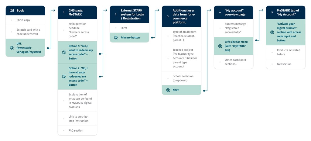
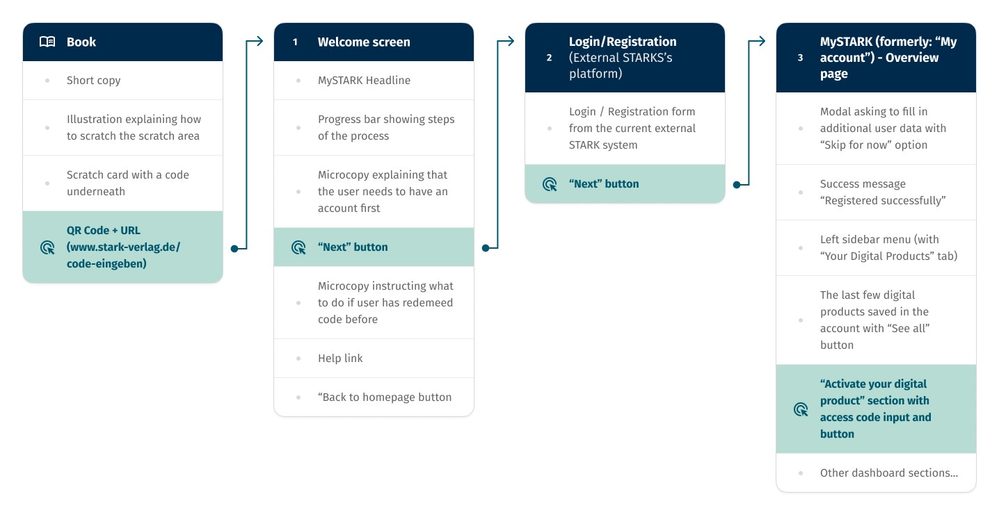
To document and communicate the proposed changes effectively, I utilized breadboarding. This prototype technique mixes the benefits of wireframes and user flows in a simplified form. Like wireframes, it quickly highlights the content of each screen. Meanwhile, it maps out the process in a less complex way than user flow diagrams, making it ideal for our project's linear process.
Final outcome
The new MySTARK user experience
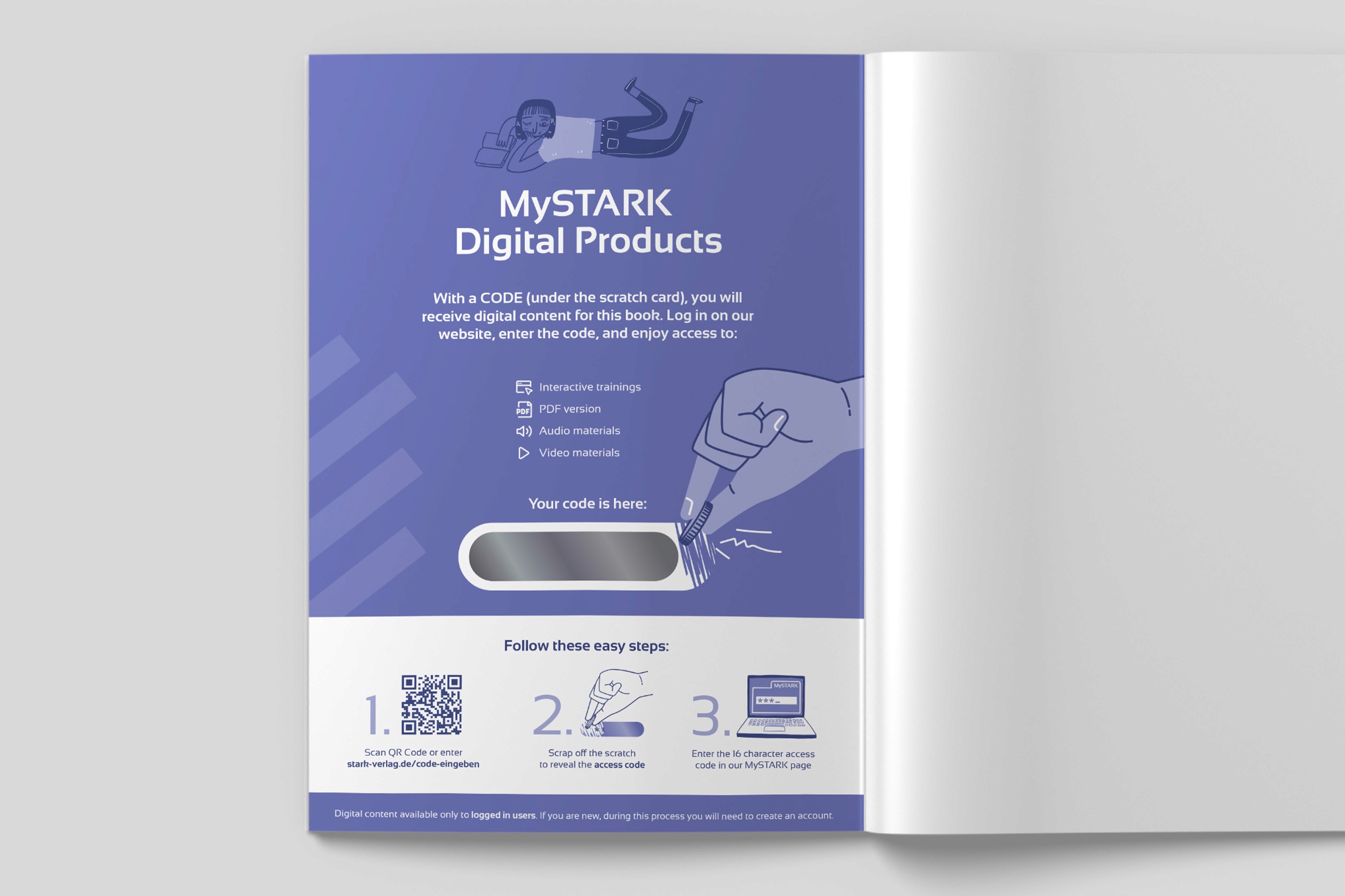
1
New inside back cover of the books. Enhancing user guidance from the very first step.
To address the confusion some students experience with revealing the access code, we designed a brand new, self-explanatory illustration for the inside back cover. This visual aid not only makes it easy to understand how to reveal the code but also brings a playful vibe to the customer experience.
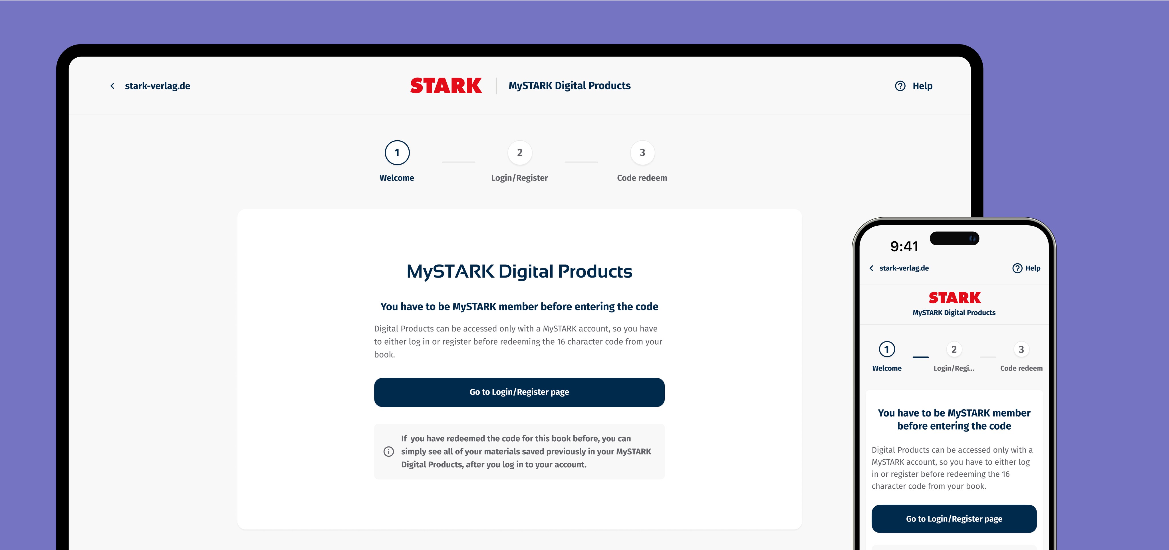
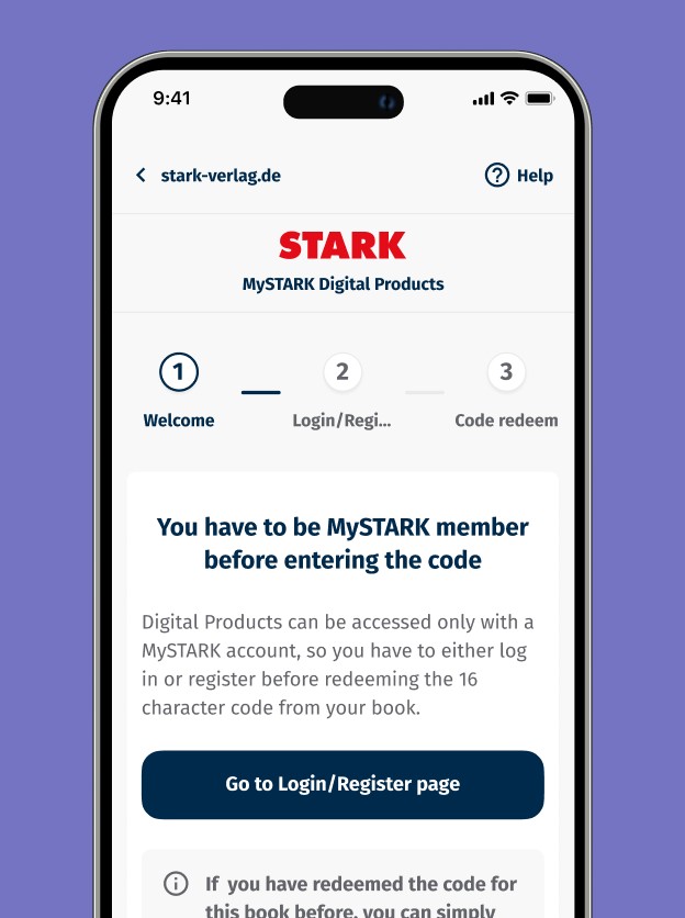
2
New landing page guiding user through the process
We introduced new landing page that is the first digital touch point after user opens their book and scans the QR code (or enters the URL manually).
It contains all of the UX design essentials needed to smoothly guide users through the process:
The wizard that transparently informs about the active step and the remaining steps,
Enclosed design that minimizes distractions by focusing the user's attention solely on the task at hand,
One clear primary button,
UX writing that provides clear, concise instructions.
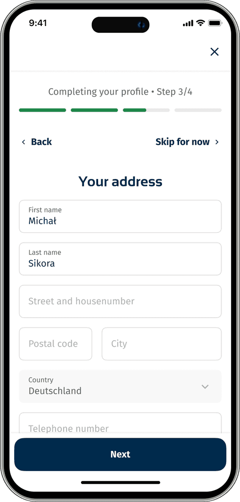
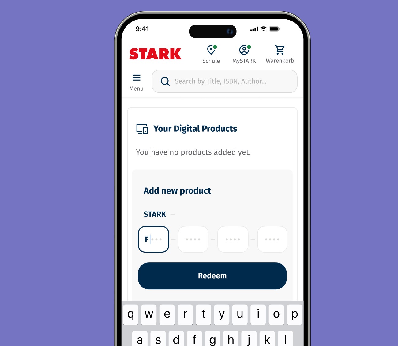
3
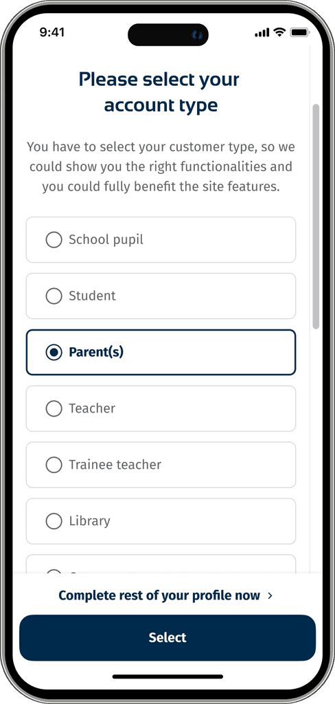
Streamlined account setup process
We’ve optimized the account setup that follows the initial external system registration by showing only required account type selection. Our goal was to prevent users from feeling overwhelmed by an extensive process and to shorten the path between the first touchpoint and accessing the digital materials.
Any optional details for profile completion are now presented as a separate, voluntary path with the option to skip each step if desired.
Before
After
4
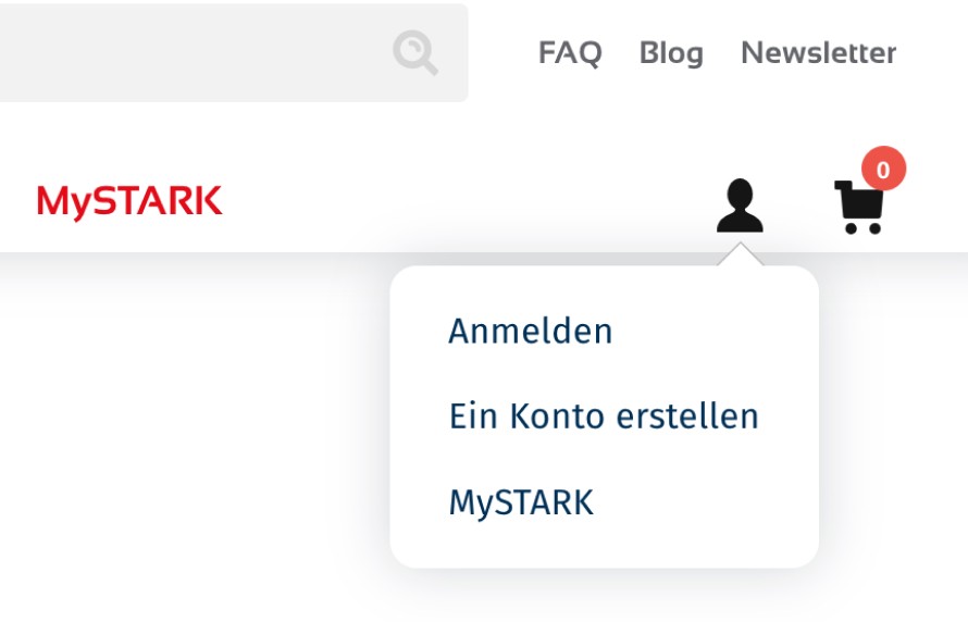
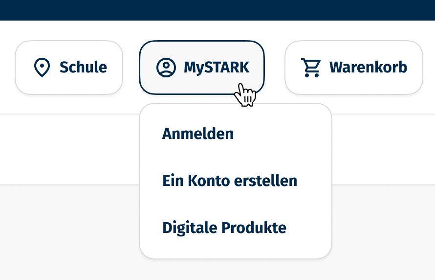
Clear langauge makes a difference. UX challenges solved with simple wording changes.
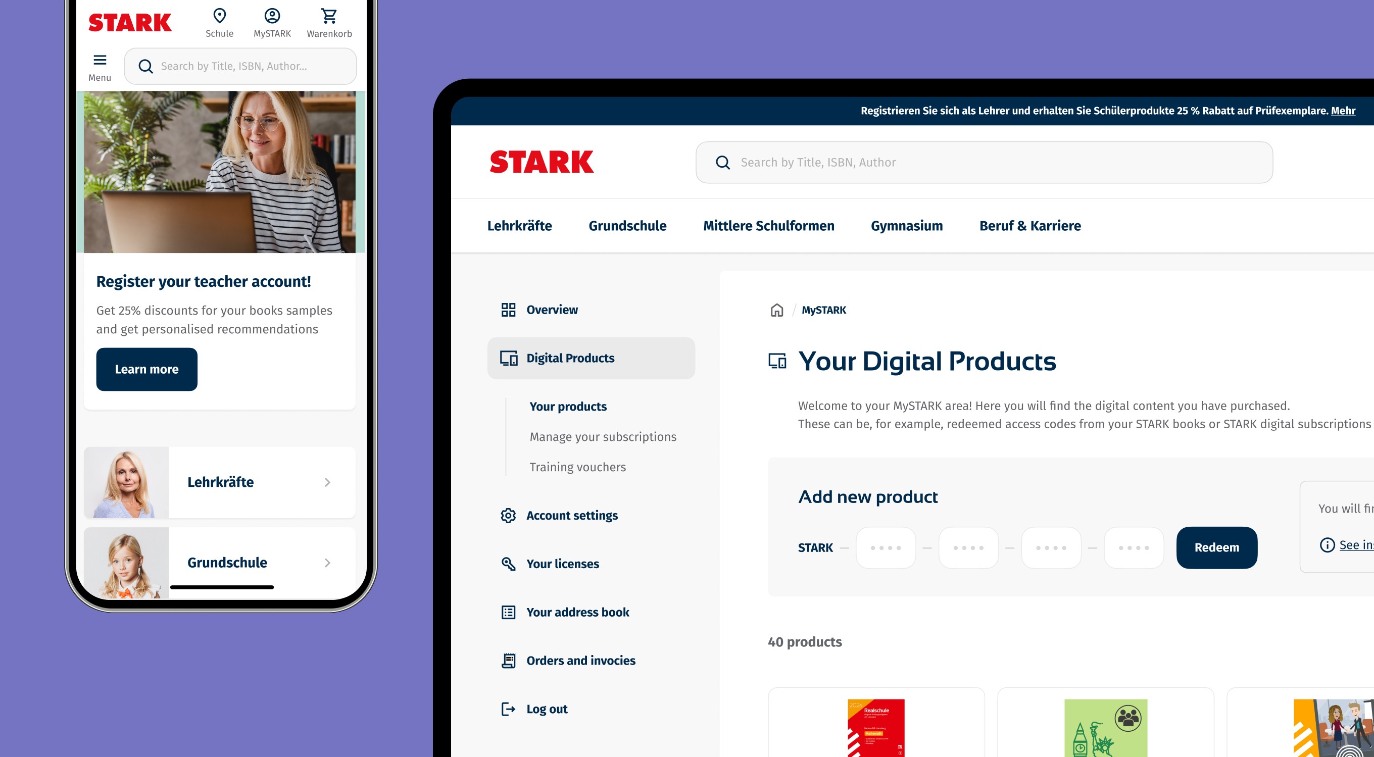
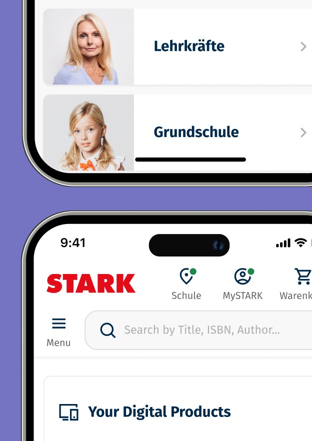
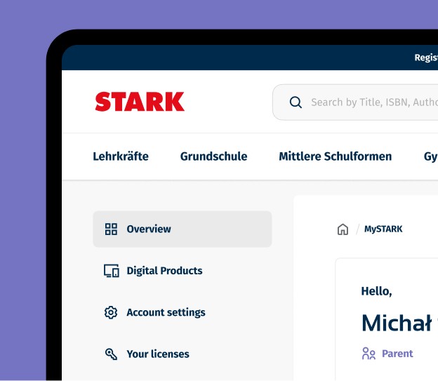
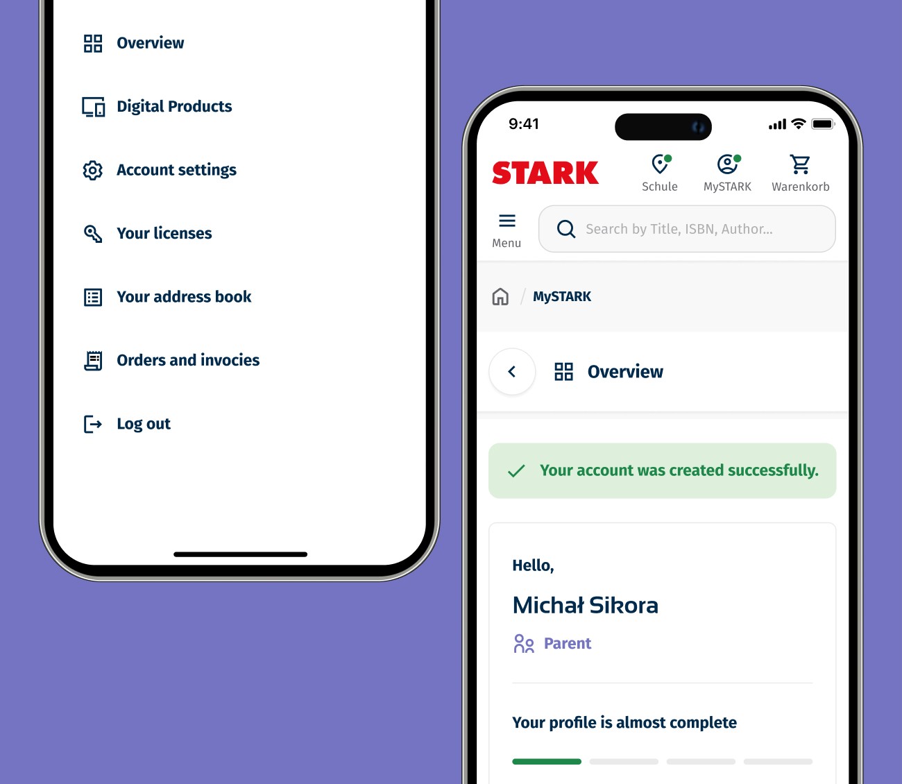
We knew that people think of MySTARK as the place to find digital products. We also knew that having an account to access MySTARK is mandatory. So, we simply rebranded the entire user area as 'MySTARK' and established a clear path for users to access their digital materials from the account dashboard, renaming the subpage to the self-explanatory 'Digital Products.'
Additionally, we removed the former red 'MySTARK' link from the first-level navigation, which was just a pre-step landing page that ultimately led users to login/registration page.
5
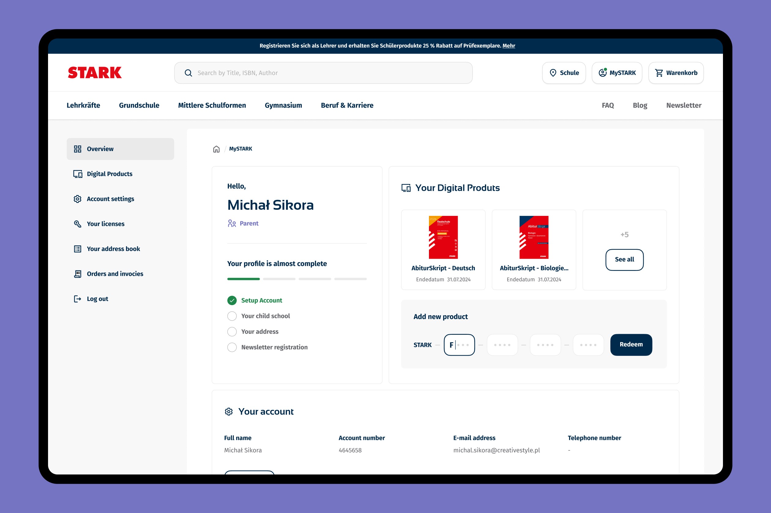
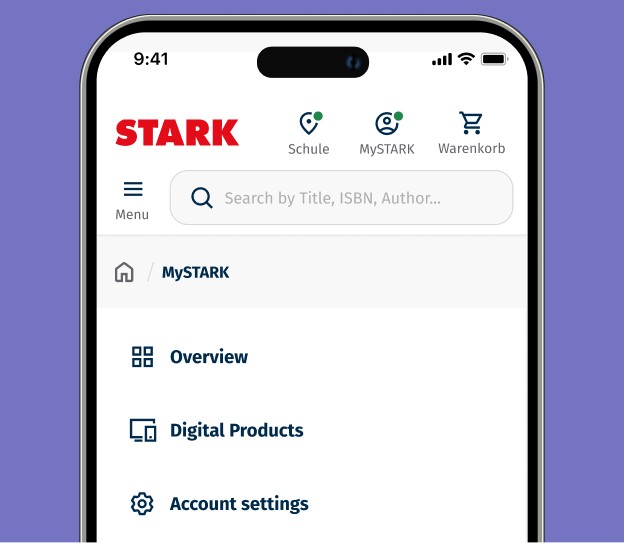
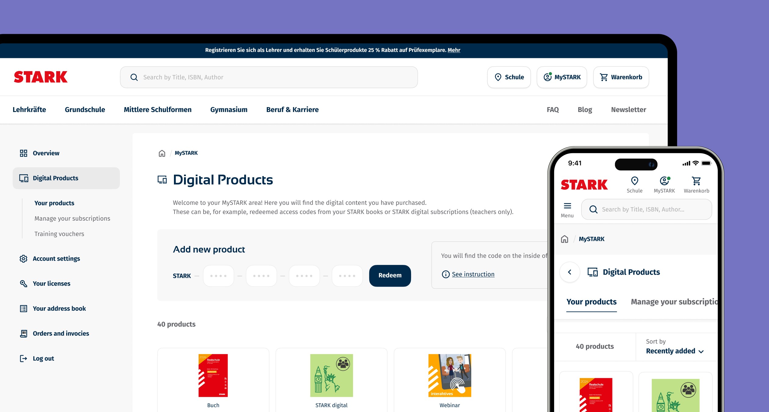
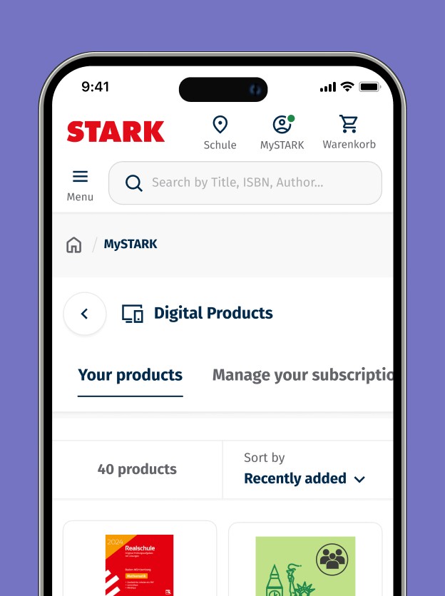
New account dashboard page
The new account dashboard was designed to provide all essential paths at a glance. Users can now immediately see their digital products and have the option to access new materials using a code from their book.

6
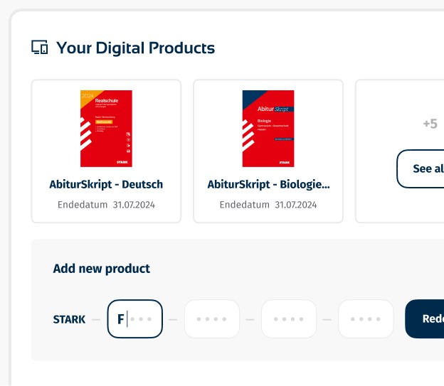
Reorganised information architecture
The redesigned section now consolidates all digital materials that users can access, along with related options such as managing subscriptions and digital training vouchers, which were previously separate menu pages.
These options have been renamed and grouped under the 'Digital Products' section, simplifying navigation and enhancing the user experience by keeping everything in one place.
7
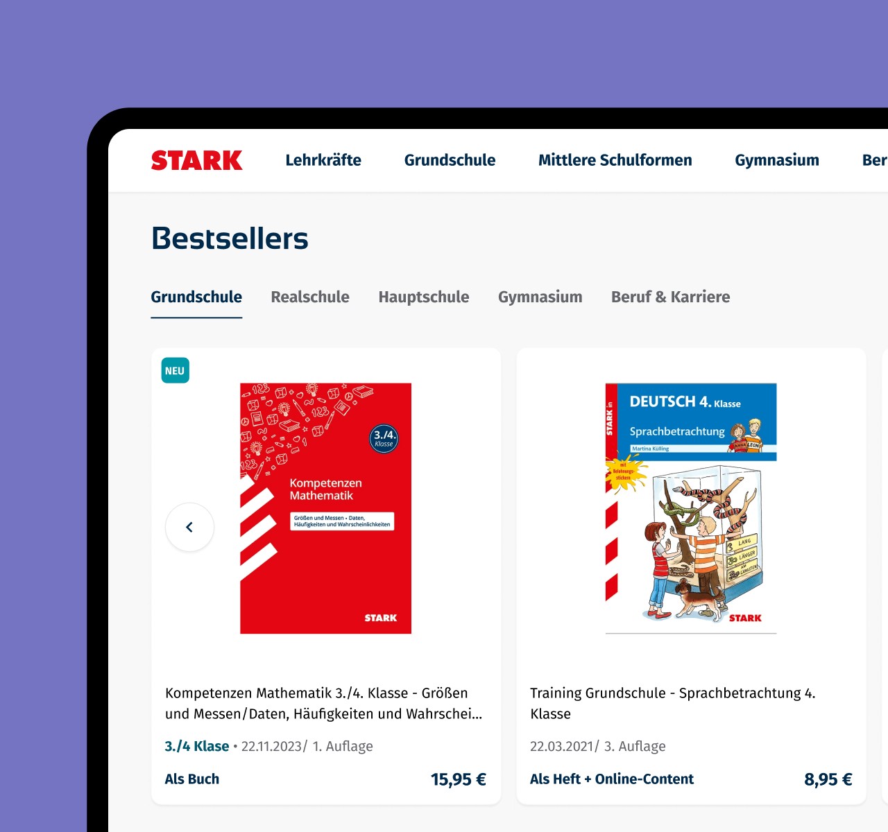
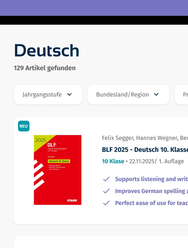
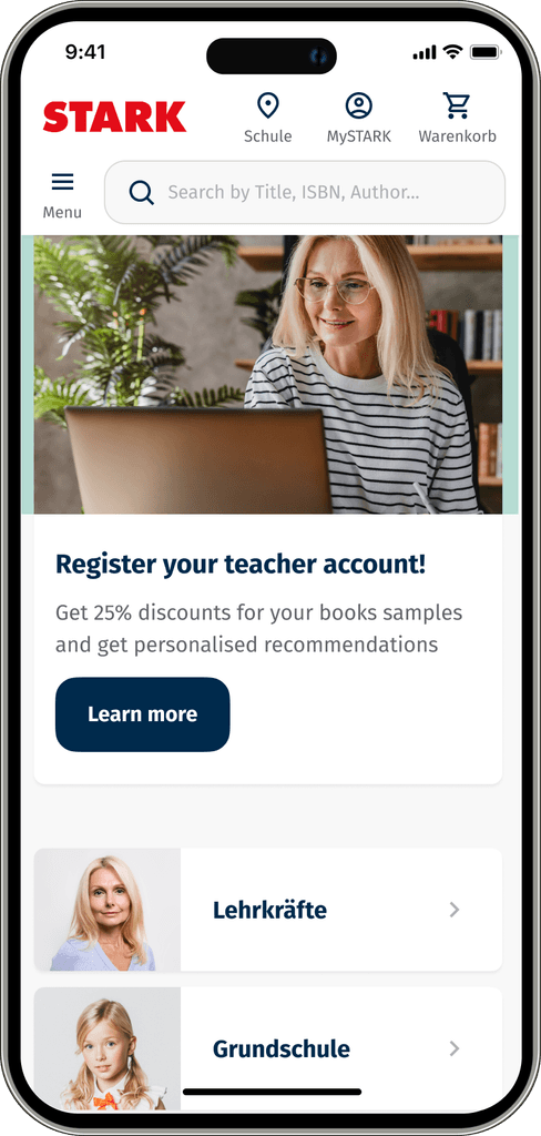
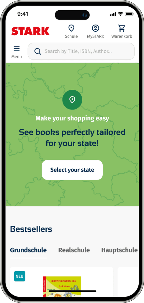
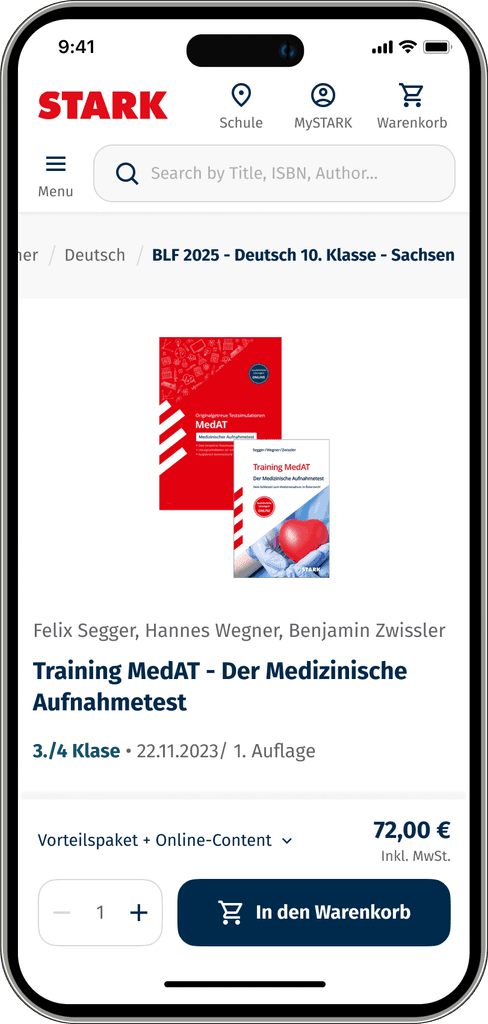
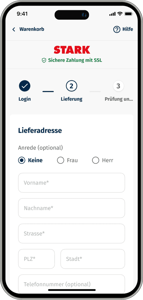
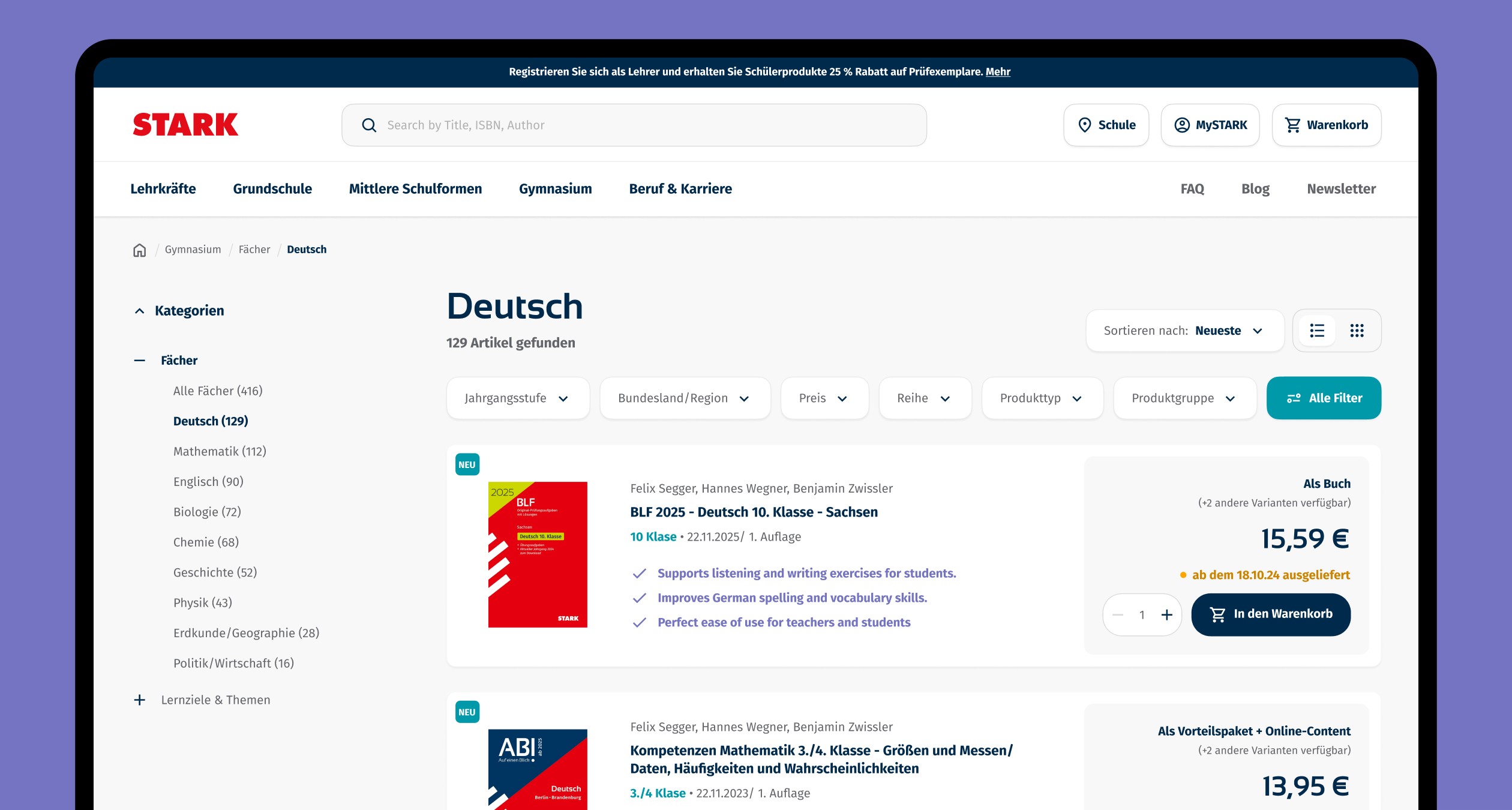
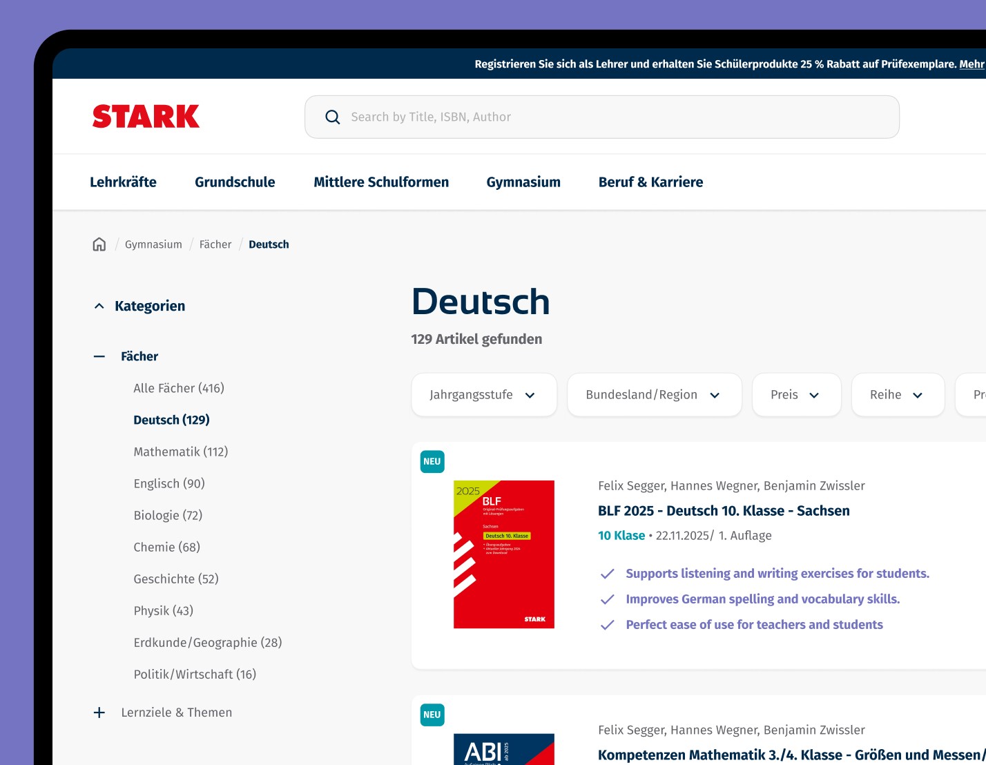
In addition to enhancing the code redeeming process and My Account area, a significant part of the project involved a comprehensive redesign of the e-commerce store. This included updating the product listing page, homepage, filters, navigation, search functionality, product pages, blog articles, CMS pages, and campaign pages, for both desktop and mobile platforms.
The redesign was guided by best practices from the Baymard Institute, focusing on usability and conversion optimization.
Recommended next steps for the UX strategy
Conduct a usability test covering the full user journey of redeeming a code from the book and optimize usability
Set up an analytics tool for e-commerce conversion funnel analysis.
Introduce behavioral analysis with HotJar to identify weak points in key user journeys.
Establish an A/B testing strategy to optimize the e-commerce funnel.